I’ve been living in my small space for about six years now. The kitchen and bathroom are both spaces that I have been wanting to refresh for years. They were functional and okay but they weren’t pretty enough for pictures and both spaces needed some love! I’m happy to share my small space refresh of the kitchen.
Here is the old countertop, sink and faucet…
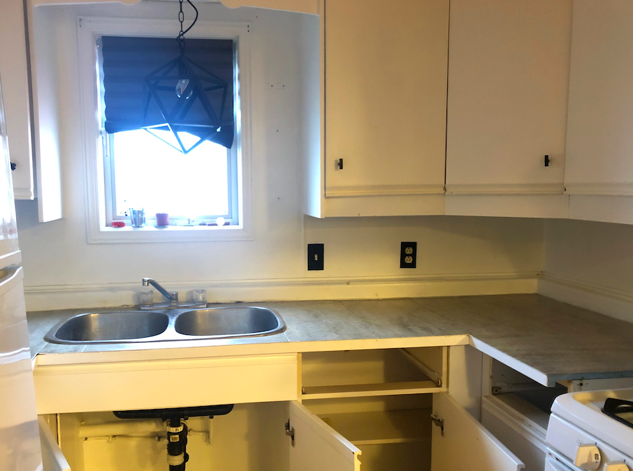
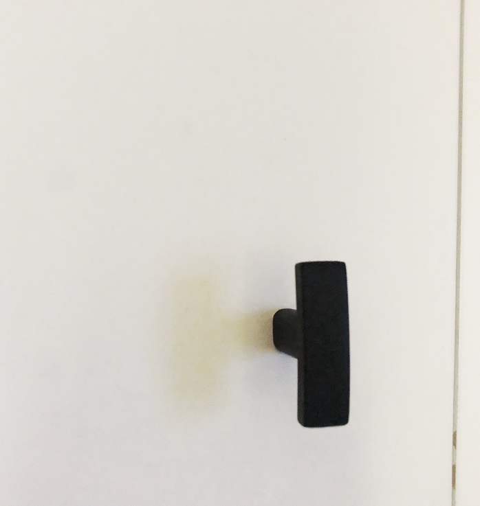
The first thing we did was update the cabinets and hardware. I removed the cabinet doors and had them repainted. With a fresh coat of white paint, the space was looking a lot better. What really put the cherry on top was new hardware! I got matte black knobs from Home Depot Canada.
Next up, that ugly light. I’m not sure if the light that was there was trendy back in the day or what… but it had to go. I asked for a matte black light fixture for my birthday (talk about adulting!) to replace this. Believe it or not, I actually changed the light fixture ALL by myself. Changing the light was a great idea.
With the space feeling brighter and clean, the next thing I wanted to do was rip out the counters. Well, I don’t even think they were counters.. I’m really not sure what the people who owned this had in use but they were not cute. I looked …and looked even more at options. I was quoted $600 for laminate countertops and thought that seemed pretty expensive. Finally… I found simple, white laminate counters that would look so much better in the space. I placed an order online from IKEA Canada for two white countertops and we cut them to fit upon arrival. The delivery took a full month – but when they arrived, I was so happy.
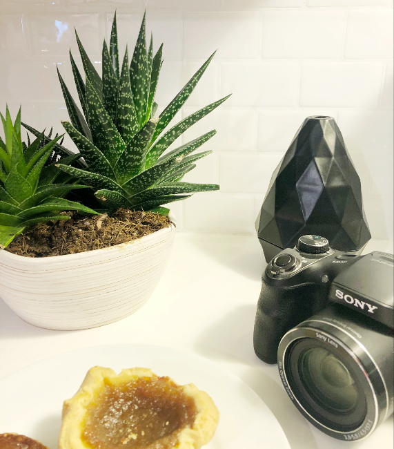
These counters were SUCH a great idea. Yes, I would have loved granite countertops but let’s keep in mind, this is not my forever home and anything was better than the before.
With replacing the counters, came the sink. The sink I had was not okay – one of the drains was rusted and couldn’t be used for anything other than holding the drying rack for dishes. I came across Artika Official, based in Montreal. They make stunning sinks! They were on board to partner with me for this project and graciously provided me with the ODYSSEY SINGLE BOWL STAINLESS STEEL SINK. I decided to free up some counter space by selecting a single bowl sink. This one was sharp! It was deeper, larger and really compliments the space.
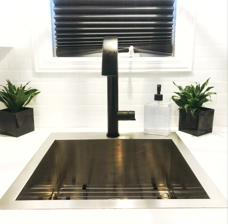
With a sweet sink in place, a faucet was needed. I knew I wanted something matte black to accent the hardware on the cabinets and my decor. My followers, friends and family know that I love matte black! Delta Faucets Canada had a couple options but ultimately, the KEELE SINGLE HANDLE PULL DOWN KITCHEN FAUCET stole my heart. Let’s take a minute to appreciate this! It’s truly the focal point of my kitchen. This faucet swivels 360 degrees, making it so easy to get out of the way and load up the sink. It has a pull down handle, making things a lot easier. Little things? Well, these are things I never had before!
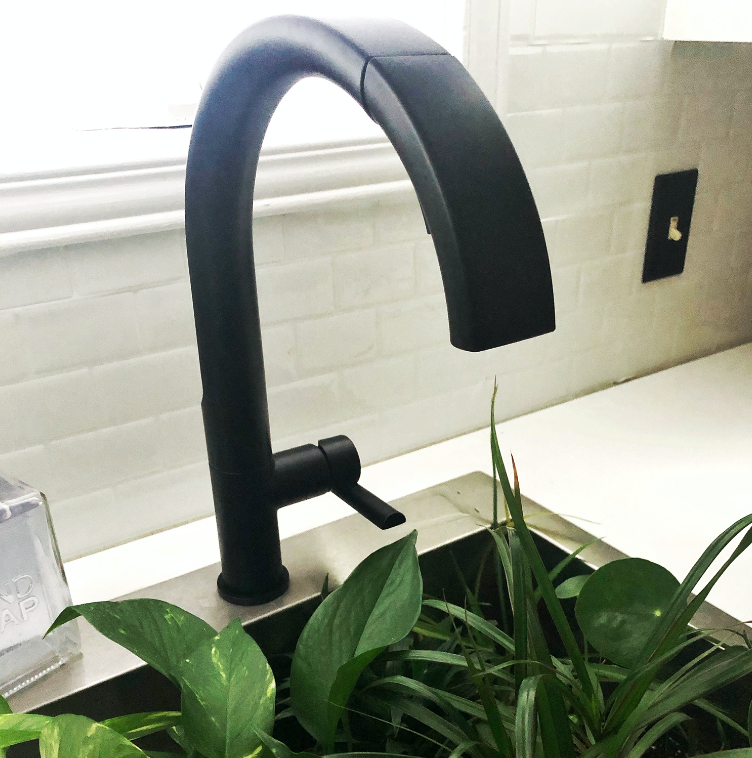
The next thing we did was add some backsplash. No, we didn’t start cutting and grouting. We used Tic Tac Tiles. They have a great selection of peel and stick, self-adhesive removable tiles. Plus, they’re an Amazon seller so delivery was quick. I picked the pure white and wow, did it ever change the space completely! It was easy to install. I would certainly recommend you have a boxer cutter, a level and a pencil on hand for this.
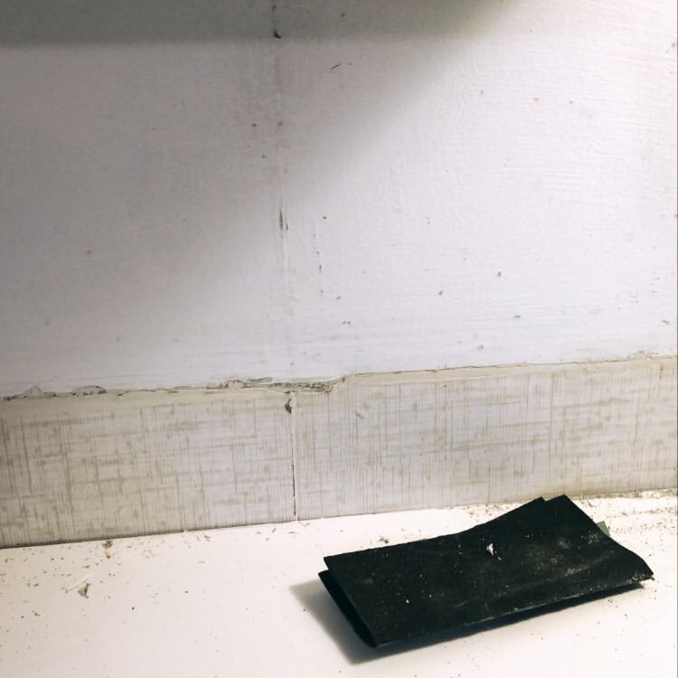
As you can see, the before and after is pretty crazy. The kitchen looks so much nicer now. Plus, it’s so on brand! I wouldn’t have been able to do it without support from amazing brand partners like Delta Faucets Canada, Artika and Tic Tac Tiles. So if you’re like me… wishing you had a new kitchen – take the next step! It feels so nice waking up and brewing a coffee in the kitchen. It’s bright, functional and looks so much better. Plus, the kitchen and bathroom are the best spaces to upgrade! Sooo… bathroom next?


